Week 5 of "The Block" was full of Drama, with a little crying a Funeral and 4 bathrooms. Here are my pics for the week:
My Number 1- Mark & Erin
Like: I like the feature tile, They used it in the Master Bedroom Ensuite also (See Below).
Dislike: I think that the floor tiles that they used for the main bathroom are cheap looking.
Change: Remove the sticker from the toilet.
(Mark & Erin's Ensuite)
My Number 2- Brenton & Chez
Like: The Glass feature wall, Reminds me of Carrara Tile with Beautiful Blue Grey tones.
Dislike: The Basin, as the judges noted it was not practical (& will probably date).
Change: Edit the room. Take a few of the decorative Pieces away, too many flowers & pots. Why not hang up a nice Black and white photograph from Vaucluse (The area where the Block is filmed).
Grey Bathroom Carrara Tile Via Here
My Number 3- Neisha & John
Like: The bathroom Vanity, Huge sink, lots of bench space and storage
Dislike: The colour palette is very non imaginative & Safe, do something different, a pattern, colour?.
Change: Replace the 1/2 used roll of toilet paper on the hanger...you are presenting a room!
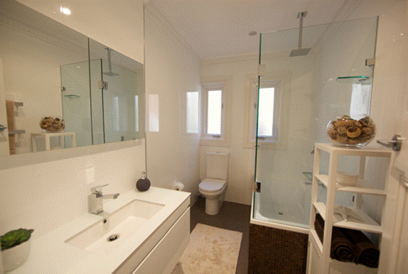
My Number 4- Mark & Duncan
Like: The shower head in the bath tub & the glass storage shelf in the bathtub.
Dislike: Random placement of additional shelving, it is not permanent shelving and I think potential buyers would look at the room and think that there was inadequate storage in the bathroom (That white boxy looking storage thing to the right of the photo).
Change: Take away the Nana looking bath mat for the Judging & style photo's.
ir a principal |
Ir a lateral
Archive
-
▼
2010
(819)
-
▼
November
(113)
- Victoria's Secret
- Christmas- Gift wrapping
- Holiday Gift: for the man in your life
- Bb. Round Classic Hairbrush
- Grand Designs Australia & A little bit more about me
- Flowers- Hydrangeas
- Wow. Happy Holidays!
- Yo Gabba Gabba Fabulous
- Cover Girl: Rihanna
- WINTER 2010- Warm It Up.
- Victoria Beckham's Beauty Secrets
- It's a Blue-tiful World
- DIY- Paper Doily Christmas tree lights
- Wall Art
- The Little Red Dress
- Bb. Flat Classic Hairbrush
- BLAKE LIVELY
- Style Icon: Cheryl Cole
- Eighties Comeback???
- ZIPPORA SEVEN
- Holiday Party Essentials
- THE ULTIMATE PLAYLIST; September - November 2010.
- BEACH HOUSE GIG- and Victoria Legrand as a style i...
- Get a Special Discount Code
- Happy Thanksgiving!!!
- Zara Evening Lookbook
- Emma Roberts: For Marie Claire
- navy velvet
- Little Miss Watson
- SPARKLE-Y
- Yay! It's almost Christmas time
- American Music Awards 2010
- Best Dressed Couples
- The Block- And the Winner is....
- The Little White Dress
- Room For 1- Styling a small apartment
- Holiday Blow Out
- The Block- Auction Day
- Getting to know me
- American Music Awards 2010 Red Carpet
- Best Dressed: American Music Awards
- Ombre Hair Color
- Electric Feel
- Happy Birthday
- Winter's Miracle Product
- Wardrobe Inspiration
- The Block- Week 7
- FOREVER 21 takes Dublin.. By storm?
- Almond Jam Cookies
- Quote of The Day
- DIY Cake Stands
- Aboriginal Art
- Live Fully travel bag
- Best Dressed of the Week
- Disconnect Magazine
- Seaside Bliss- Bells At Killcare
- Glass Display
- Powder Room Renovation
- The Messy Chignon
- Vaseline On A Stick
- Wedding Flowers
- Silk Ikat Pillows
- Blog Love
- MOCA Los Angeles Gala
- GORILLAZ- The Plastic Beach Experience.
- Congrats!!!
- Want 20% off at ASOS but don't have an NUS Card?
- I'm a Barbie Girl in the Pink Barbie World
- Cleaning Brushes?
- Live Richly gift box
- Rimmel Lasting Finish Lipsticks
- DARWIN DEEZ.
- Hello models!
- Grungy Fashion + DIY Studded Combat Boots
- Our Honeymoon- New Zealand- South Island
- The Block- Week 6
- FIRST LOOK: Holiday Gifts
- BIG Hair!
- Kardashians unveil their new Mastercard
- Lauren Conrad for VH1 Save the Music
- Lampshade project
- Wall Art
- Lucite tray & Gold Bowl
- Our Wedding Day 21.2.10
- Sideboard- TV Unit
- Olivia Wilde in Vanity Fair December 2010
- Quote of the Day!
- Wedding's- Candy Buffet
- Laminate Timber flooring project
- Europe Music Awards: Best Dressed
- Product Spotlight: Bb. Gel
- Ombre Hair
- Not-so-basic LBDs
- Beautiful Red
- Side Table project
- The Block
- Fabric
- signed by tina
- Racoon Hair Extensions
- The famous Little Black Dress
-
▼
November
(113)


